




Massachusetts Opioid Treatment Program, Training and Technical Assistance Center
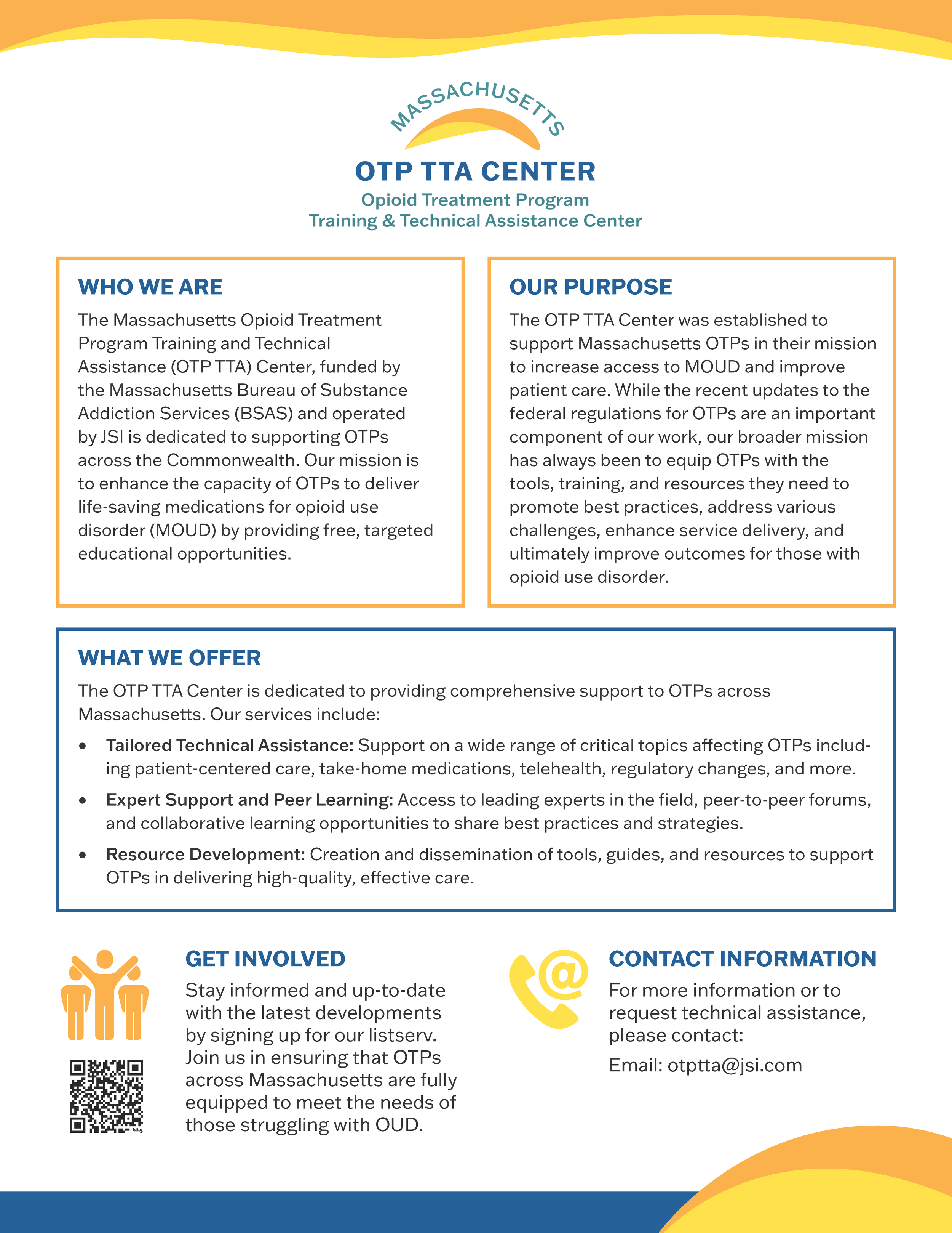
For this project, the client wanted a friendly, optimistic identity that incorporated the center’s full name. The challenge was to integrate both the organization’s abbreviation and full name without creating a visually cumbersome mark. I chose to give the abbreviation greater emphasis through a bolder weight and darker color, creating a clear focal point while maintaining balance and legibility.
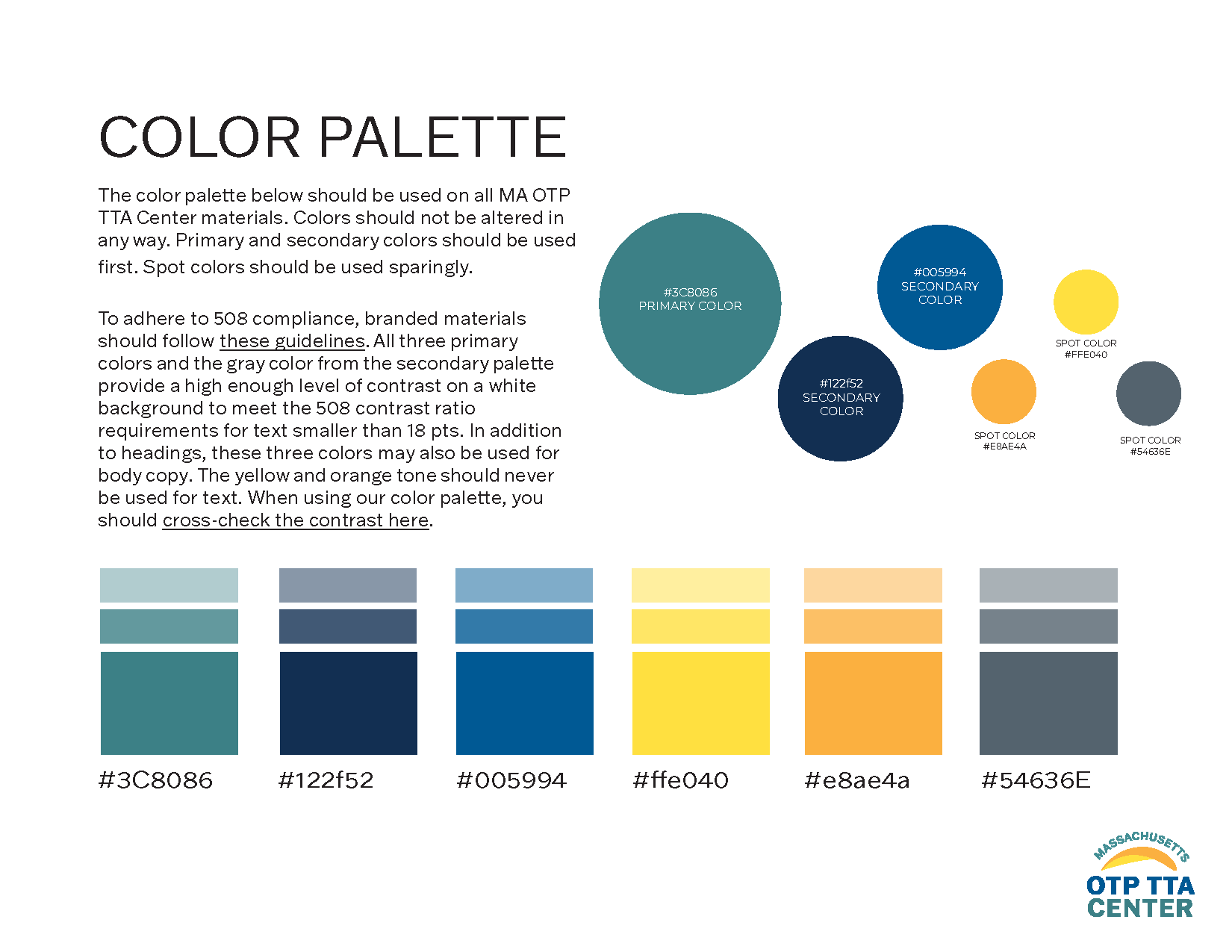
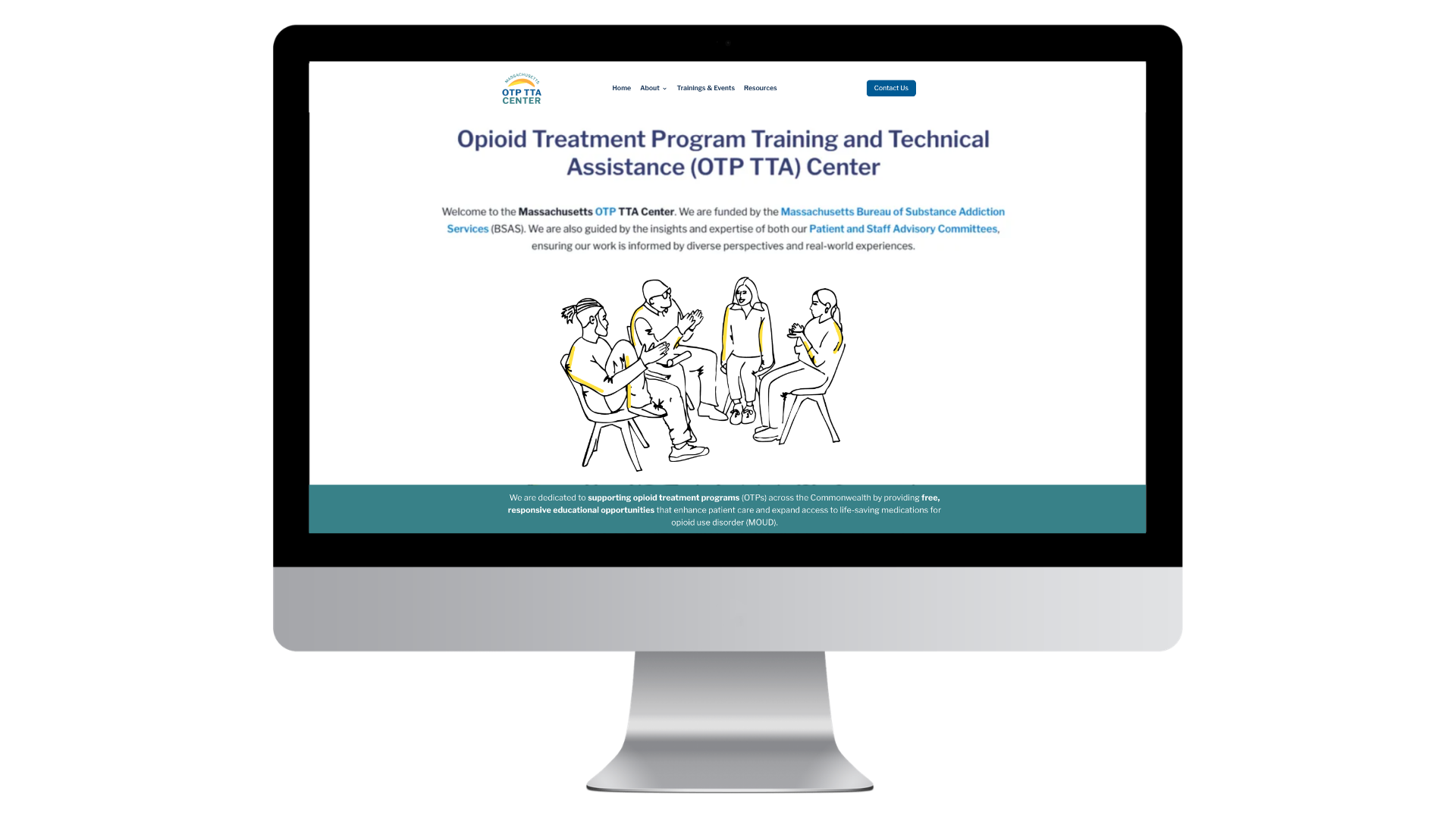
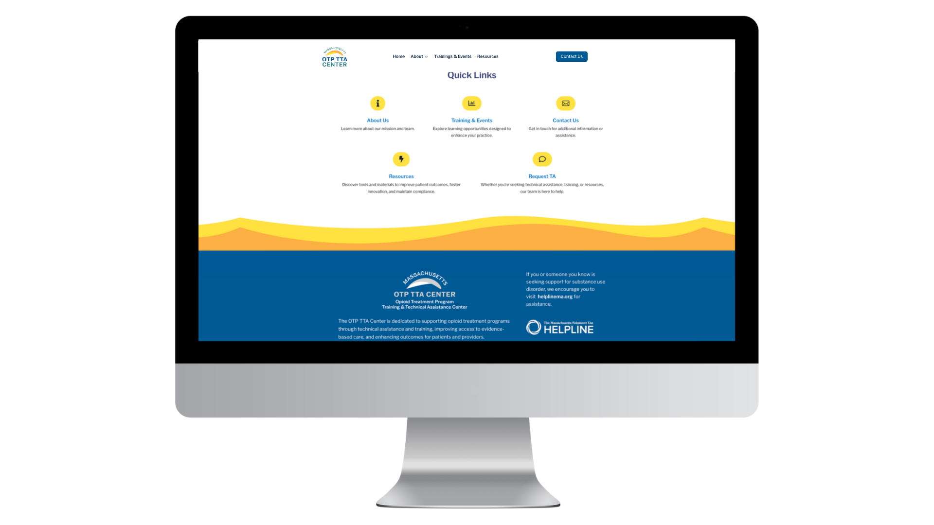
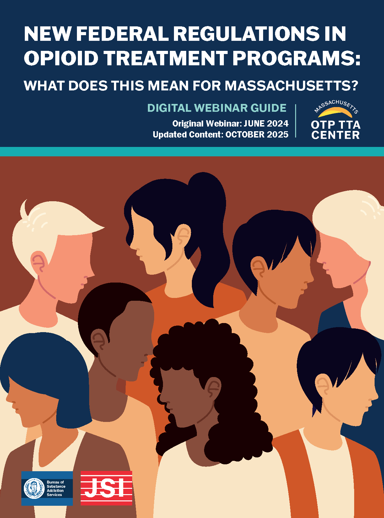
To extend the identity beyond the logo, I developed a bright, friendly color palette and a custom illustration set for use across print and digital materials. Together, these elements create an approachable and cohesive visual language, showcased across the accompanying website and handout materials.