








JSI Rebranding
Following a challenging year in the public health sector, JSI embarked on a rebrand to strengthen and clarify its visual identity. I co-led the effort as part of our design team. The project initially began as a request to update the color palette for an upcoming website redesign, but we saw an opportunity to think more strategically about JSI’s overall brand. We advocated for expanding the scope to include a broader brand refresh that would create a more cohesive identity and help position JSI to stand out in a competitive market.
Leadership chose to retain JSI’s existing logo, so our challenge was to build a more contemporary and dynamic brand system around it. We introduced a vibrant new color palette and expanded the visual language through typography, graphic elements, and a flexible design system that could work consistently across digital and print applications.
Named for British physician John Snow, a pioneer of modern epidemiology, JSI’s original logo draws inspiration from the statistical mapping he used to trace a nineteenth-century cholera outbreak in London. We built on that history by extending the logo’s city grid structure into a versatile graphic pattern—transforming a foundational element of the brand into a distinctive visual device that could be used throughout the identity.
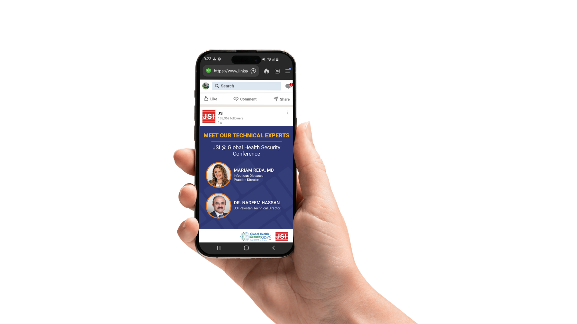
The refreshed identity was translated into a flexible suite of branded materials for both internal and external communications. I played a key role in bringing the new brand system to life, developing report templates, business cards, letterhead, PowerPoint templates, Zoom backgrounds, social media content, and other branded communications. Each application uses the new typography, color palette, and grid-based visual system to create a cohesive and recognizable identity across a wide range of formats and communication needs.